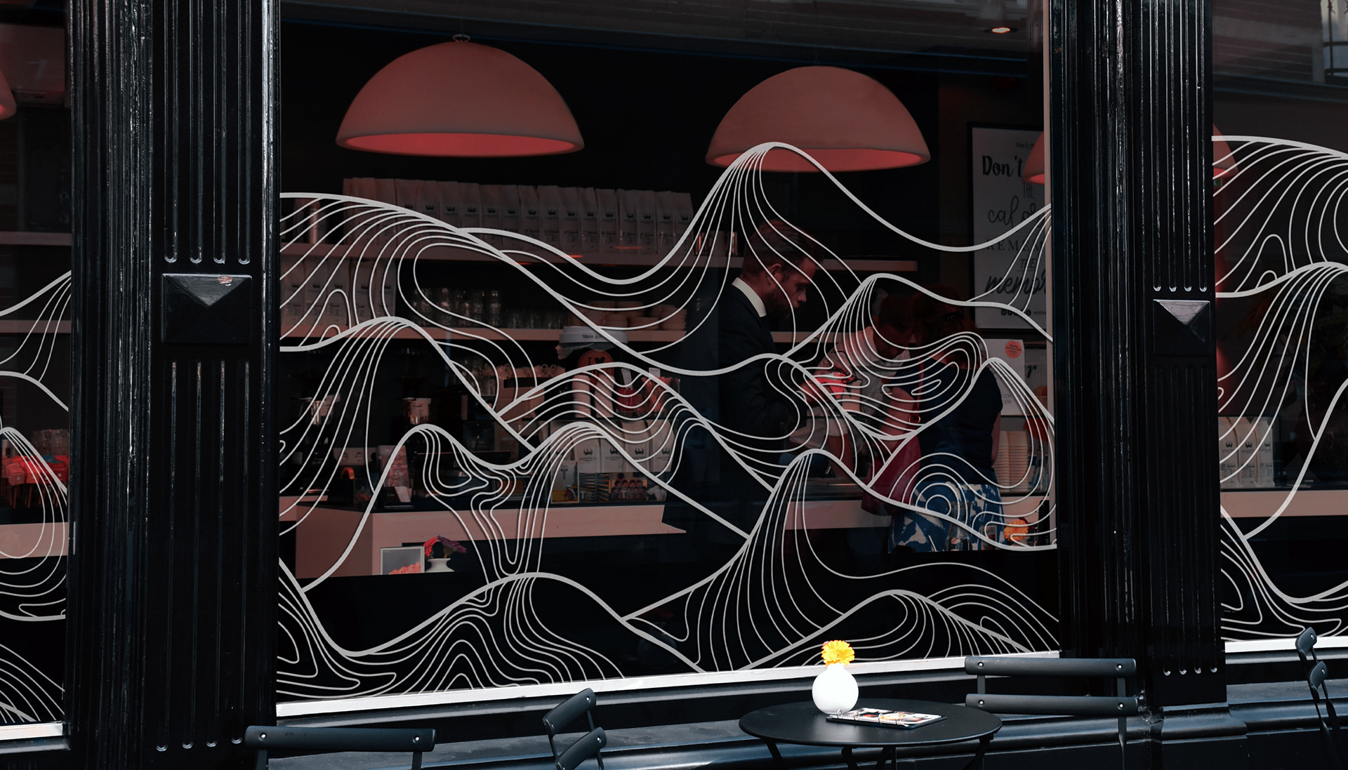

Amstir merupakan kedai kopi sekaligus roastery kopi di Kota Malang sejak Tahun 2011. Amstir bisa dikatakan sebagai pioneer kedai kopi lokal berkualitas dengan harga terjangkau sehingga membuatnya menjadi pembeda dari yang lain. Sebelumnya Amstir bernama Amstirdam pada awalnya yang memiliki arti Ampel Gading, Sumbermanjing Wetan, Tirtoyudo dan Dampit berasal dari kelompok tani 4 kecamatan penghasil kopi di Kota Malang serta akronim dari “Am Stirring a Delicious and Marvelous”. Selain itu Amstir memiliki tagline yaitu “semua bisa ngopi enak” dari harga terjangkau namun kualitas terbaik.
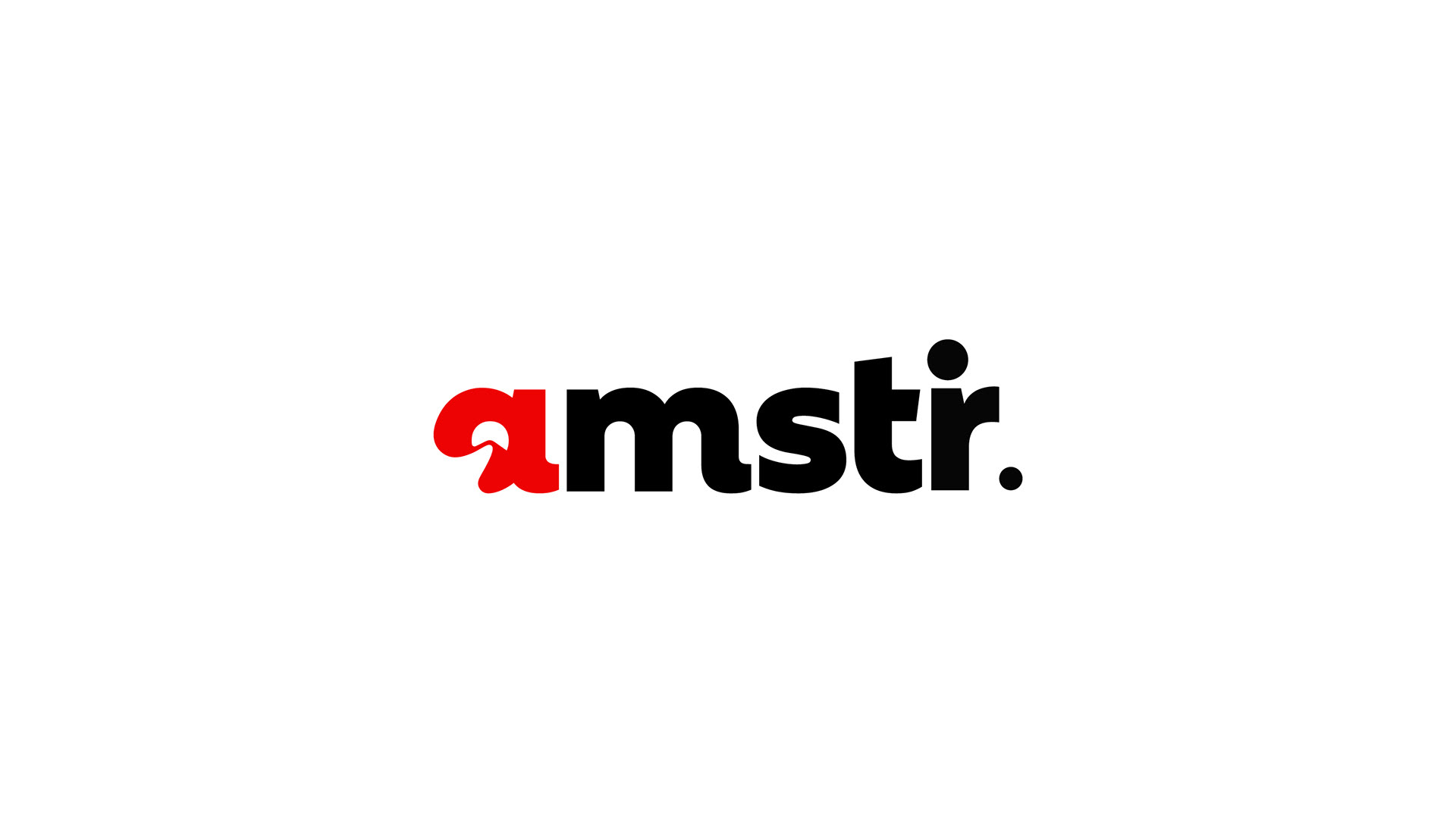
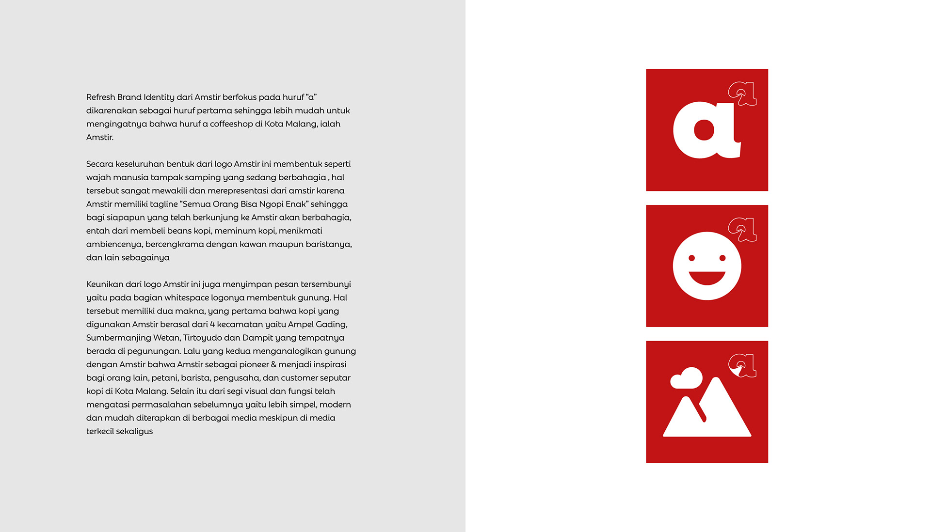
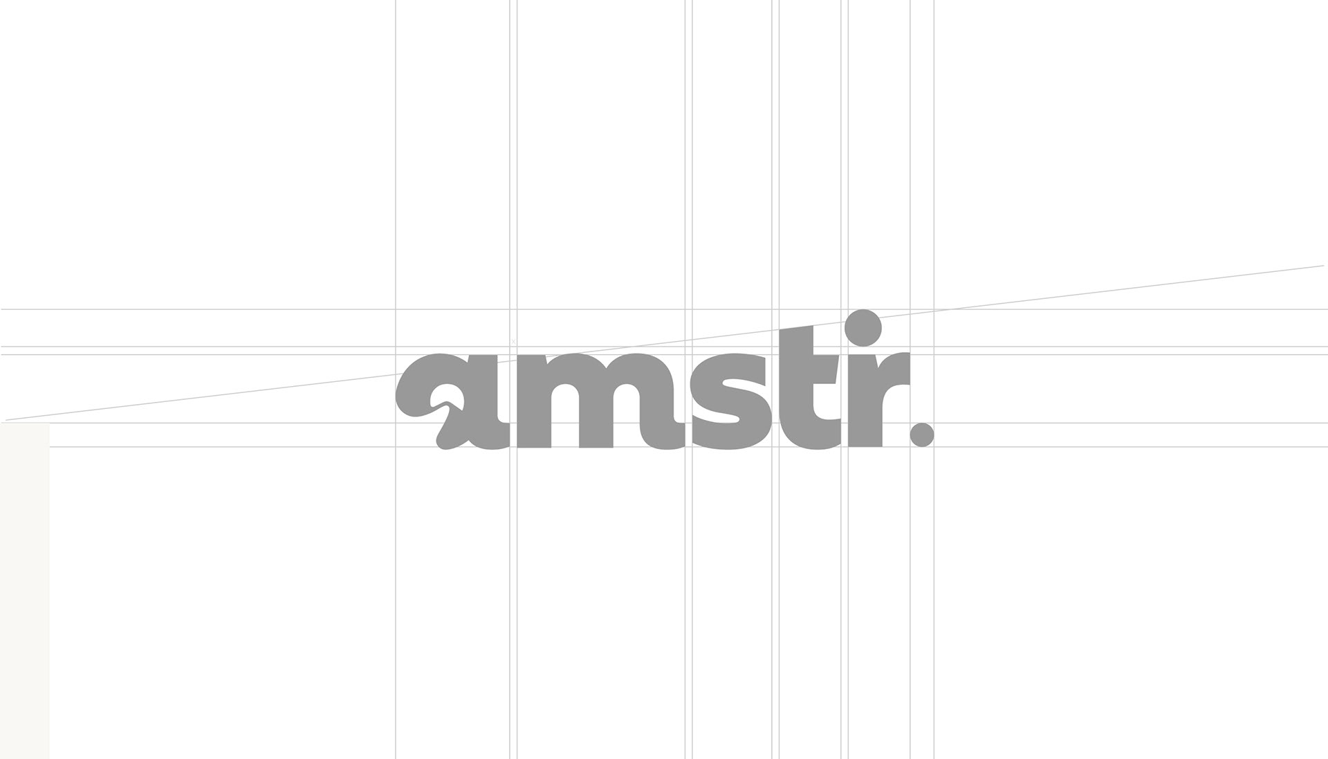
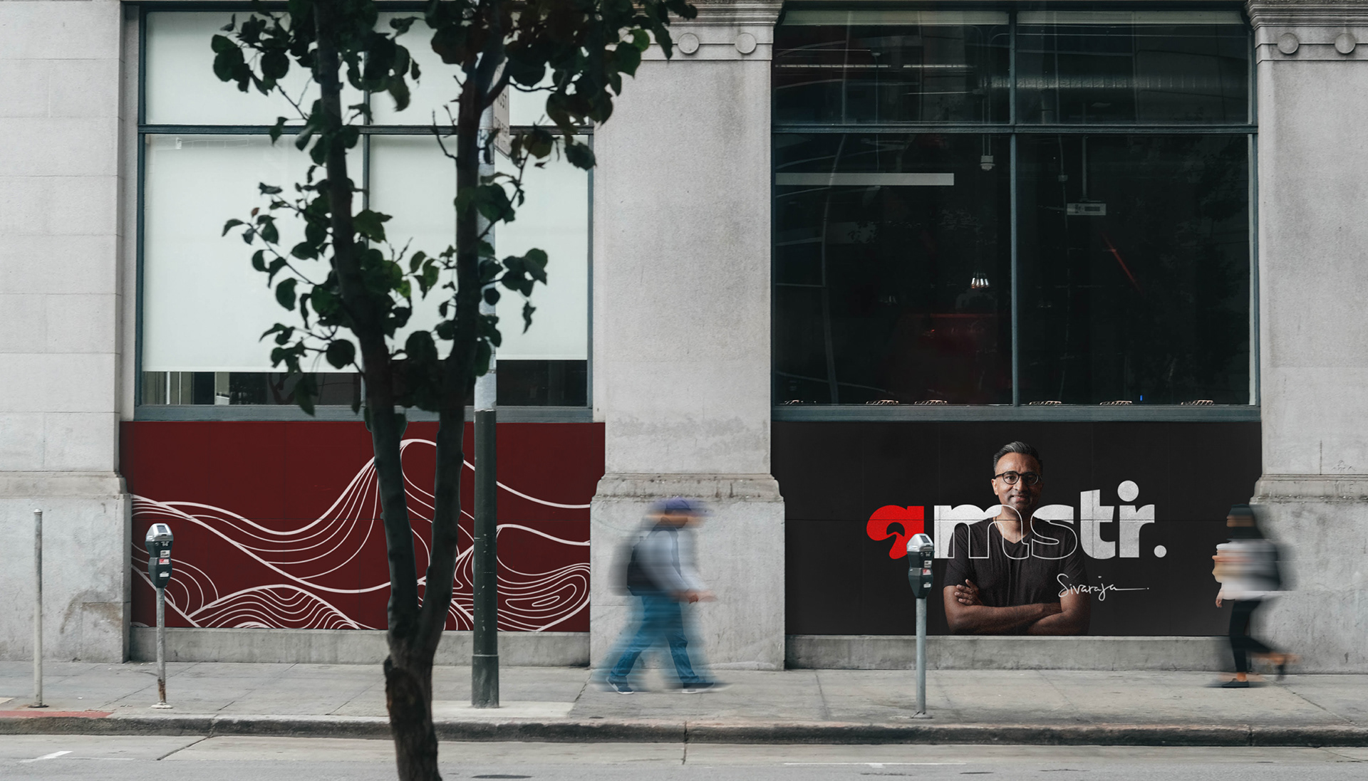
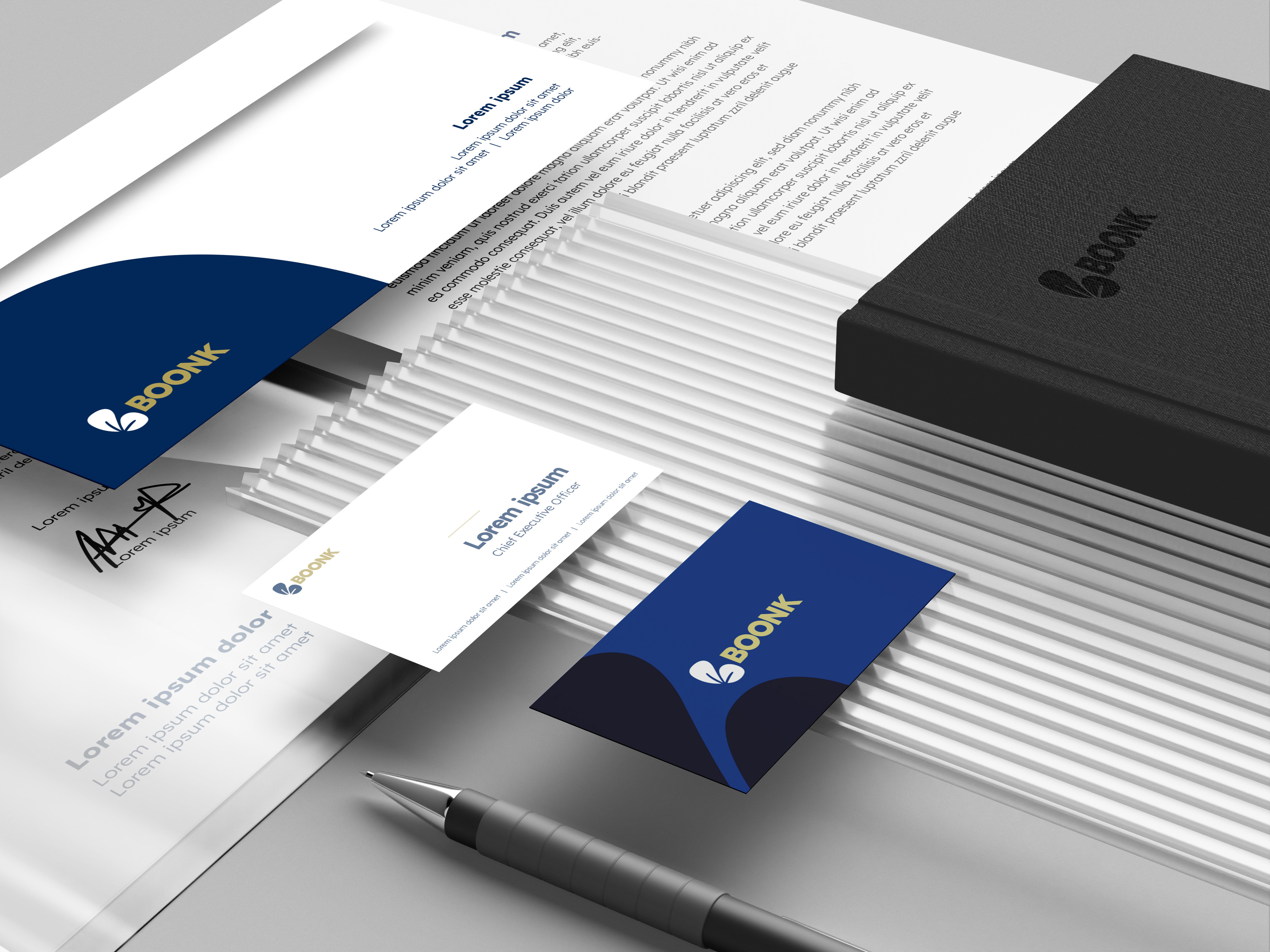
Logo Amstir mengalami beberapa kali perubahan, pertama logonya bernamakan Amstirdam dengan keunikannya di huruf "i" yang memiliki pola batik. Namun memiliki permasalahan yang susah untuk diterapkan ke media kecil, karena logonya yang terlalu panjang dan detail. Sehingga dilakukan refresh brand identity dari Amstirdam menjadi Amstir, namun muncul permasalahan baru karena logonya hanya berbentuk font saja tanpa ada nilai dari Amstir yang dimasukkan ke dalamnya. Sehingga dilakukanlah refresh logo Amstir yang dirancang oleh adnanmp dengan memberikan sentuhan value dari Amstir serta visi misi kedepannya kedalam brand identity yang baru.

Amstir is a coffee shop and coffee roastery in Malang City since 2011. Amstir can be said to be a pioneer of quality local coffee shops at affordable prices, making it different from others. Previously, Amstir was named Amstirdam, which originally meant Ampel Gading, Sumbermanjing Wetan, Tirtoyudo and Dampit, originating from a group of farmers from 4 coffee-producing sub-districts in Malang City and an acronym for "Am Stirring a Delicious and Marvelous". In addition, Amstir has a tagline, namely "everyone can have delicious coffee" at affordable prices but with the best quality.
The Amstir logo has undergone several changes, the first logo was named Amstirdam with its uniqueness in the letter "i" which has a batik pattern. However, it has a problem that is difficult to apply to small media, because the logo is too long and detailed. So a brand identity refresh was carried out from Amstirdam to Amstir, but a new problem arose because the logo was only in the form of a font without any value from Amstir included in it. So a refresh of the Amstir logo was carried out which was designed by adnanmp by giving a touch of Amstir's value and future vision and mission into the new brand identity.